Brand identity / Industrial design
Eastern
Demolition.
Commissioned identity and business cards, developed into service-led print and clearly labelled application studies.
Recognition across formats
The brief
I designed the compass-and-excavator identity and business cards to give the business a recognisable industrial character. The later flyer uses the same contrast, yellow chevrons and clear information hierarchy.
- Client
- Eastern Demolition Limited
- Design
- Daniel Hornby
- Original work
- Logo, visual identity & business cards
- Shown here
- Original artwork, motion, application visualisations and a promotional flyer
01 / The identity
Built to make
an impact.
The compass and excavator form a single silhouette, paired with a distressed wordmark. Charcoal, steel grey and white give the applications an industrial base. The yellow chevron becomes an angular accent that draws the eye across each layout.
The original artwork
Beyond the presentation.
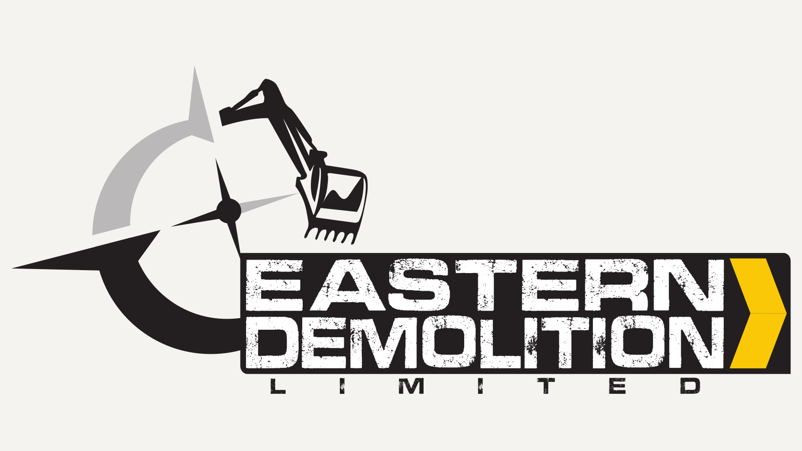
On a clean background, the relationships are easier to see: pointed compass forms, the excavator’s articulated shape and the contrast between solid geometry and textured lettering.
The supplied logo is shown unchanged. The close-ups below are selected details from that same artwork, not alternative logos or construction studies.
02 / Business stationery
Character on the front.
Clarity on the reverse.
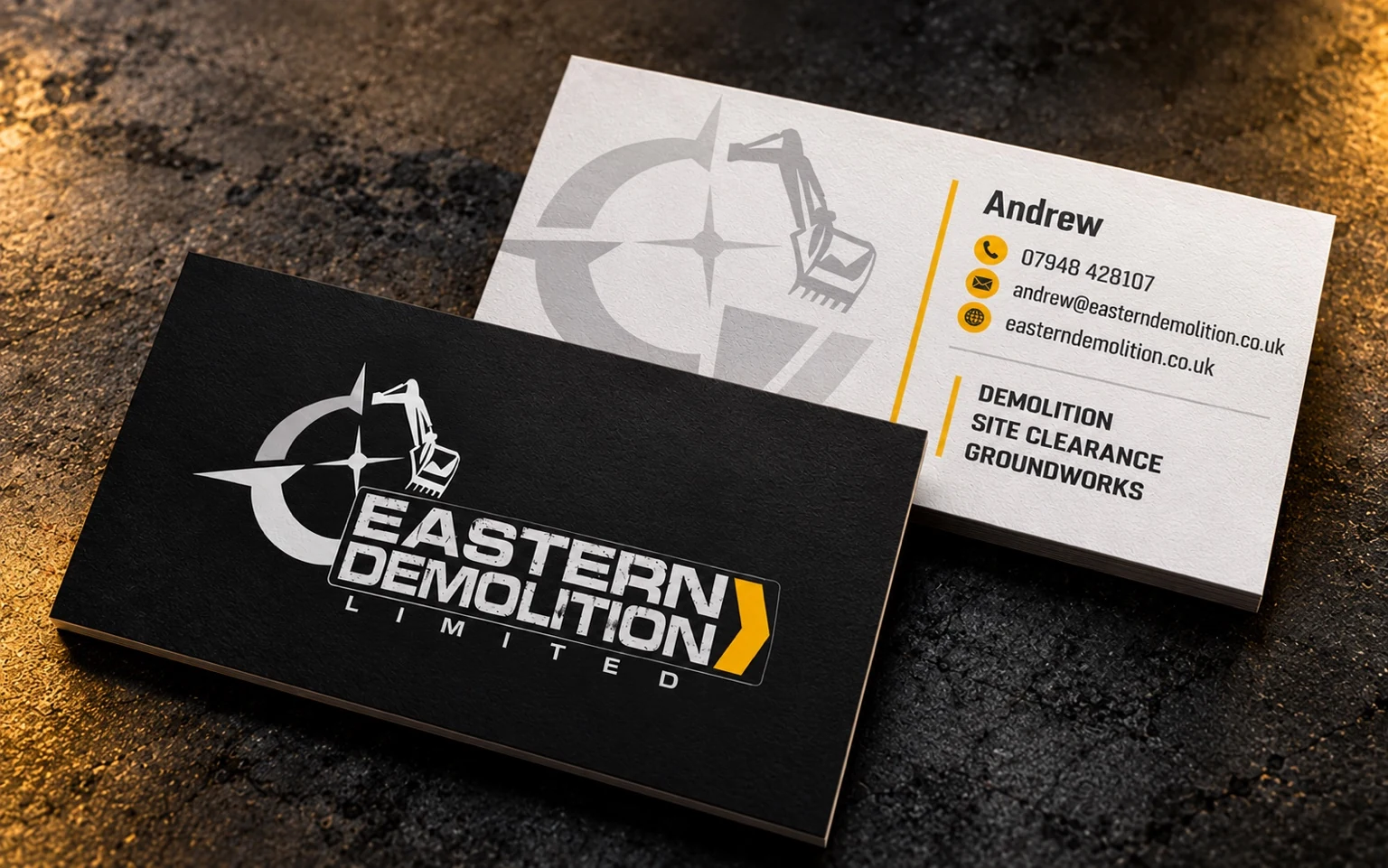
The branded side gives the identity room to make an impression. The lighter contact side uses the symbol as a quieter background element, with yellow rules and icons organising the practical information. Both belong to the same visual system.
Inspect the contact-information detail
Commissioned business-card design / refreshed front-and-reverse presentation.
03 / Promotional Flyer Design
Industrial impact.
Practical communication.
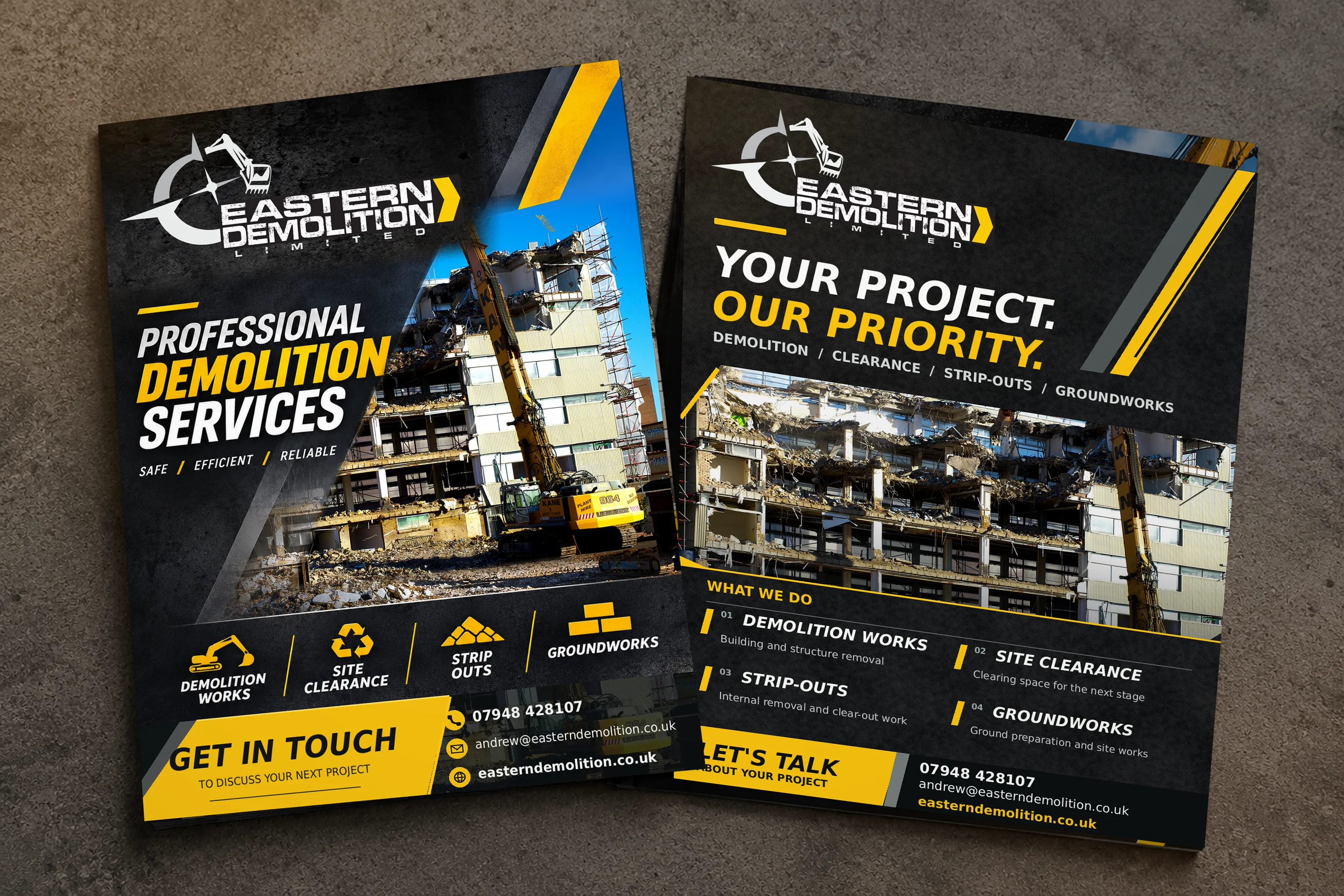
The double-sided flyer carries the identity into a service-led print design. Demolition photography and high-contrast type lead the front, with contact details close at hand. The reverse gives the services more room and carries through the charcoal textures, yellow accents and angular graphics.

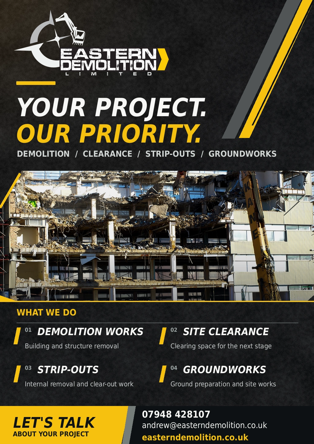
Contact on the artwork: Andrew · 07948 428107 · andrew@easterndemolition.co.uk · easterndemolition.co.uk
Explore flyer design & print04 / Motion identity
The same identity.
A controlled reveal.
Mechanical movement gives the industrial forms a natural motion language. The excavator, compass and wordmark resolve into the complete identity through the original, carefully timed sequence.

The original 5.3-second animated SVG. Plays once when the player enters view; replay to inspect the sequence. With reduced motion enabled, the completed identity is shown instead.
05 / Vehicle graphics & site signage
Recognition
at vehicle scale.
On the pickup visualisation, the compact yellow chevron expands into a broad diagonal graphic. The pale lettering and compass-and-excavator mark stand against the dark bodywork, carrying the same visual character across a much larger surface.
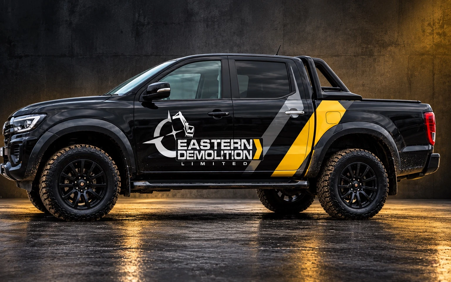
Vehicle-graphics visualisation / reconstructed application, not an installed-wrap photograph.
Request a Vehicle Graphics QuoteSite signage / Banner application
One identity.
A larger presence.
The banner visualisation brings the same mark, lettering and yellow diagonal into a wider composition. Strong light-and-dark contrast keeps the business name prominent against the industrial setting.
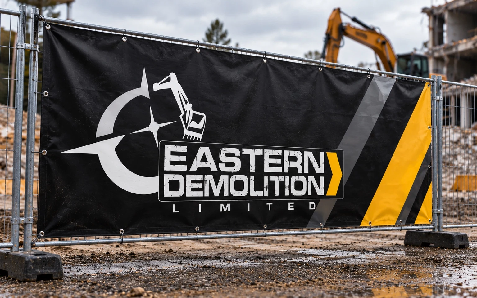
Site-banner visualisation / reconstructed scene, not a completed-installation photograph.
Banners & signage designExplore PVC BannersThe visualisation does not state a finished size. The online PVC banner opens at the standard 1.5 × 0.5m option; ask for a quote for another size.
The finished identity
Industrial character.
Consistent everywhere.
The original logo and business cards establish the identity. Vehicle and site-banner visualisations show how it scales, while the double-sided flyer puts the same typography, colour and graphics to work in print.
Project scope, design decisions & credits
The project at a glance
An industrial identity, made practical.
The brief
Give Eastern Demolition a recognisable identity and clear everyday business stationery.
My contribution
Commissioned logo, visual identity and business-card design, followed by the flyer design and later application studies shown here.
The design decision
A compass-and-excavator silhouette, distressed lettering and a yellow chevron create a consistent visual language.
The vehicle and site-banner scenes are later visualisations, not photographs of installed work. The company website is by others.
Explore the service behind this work