Case study / Logo, brand & website design
LucasBright
Cleaning.
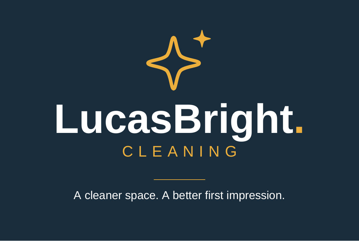
I created the LucasBright logo and visual identity, then carried the branding across its website, business cards, service-specific flyers and social graphics.
- Client
- LucasBright Cleaning
- Work
- Logo, visual identity, website, business cards, flyers, social graphics
- Area
- Greater Manchester
- Website
- View live website

01 / The brief
Start with one clear impression.
As a new local cleaning business, LucasBright needed more than an isolated logo or a single website page. People might first meet the business through a search result, a social post or a card passed from one person to another.
The design therefore needed to feel consistent across those touchpoints, communicate the practical service clearly and make it straightforward for potential customers to get in touch.
I created the logo and wider brand identity first, then carried that system through the website, business cards and supporting social graphics.
02 / The visual direction
Clean, confident and consistent.
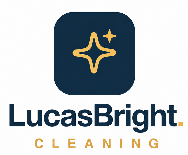
I designed the LucasBright wordmark and gold sparkle symbol, selected the navy, gold and ivory palette, and developed the supporting type and layout treatment used throughout the project.
Deep navy gives the identity a dependable, professional base. The gold sparkle mark adds warmth and a recognisable detail, while the lighter background keeps everyday information easy to read.
The same palette and graphic language carry across the digital and printed material. That repetition matters: it helps a small business look established without making the design feel complicated.
On the business card, the front creates a simple branded impression and the reverse gives contact information and Greater Manchester coverage a clear hierarchy.
03 / The website
Service detail without the clutter.
I translated that brand system into a live website where visitors can understand the cleaning services, learn how the business works and choose a clear contact route.
Its structure separates useful service information instead of forcing every subject into one long sales message. Responsive layouts make the content and enquiry actions usable on phones as well as larger screens.
Descriptive page titles, headings, internal links and a submitted sitemap also give search engines clearer information about the business. These are sound search foundations, while visibility still develops over time alongside reputation and wider business activity.
04 / One visual system
From screen to something you can hand over.
The website carries the detail, the business card keeps the essentials close to hand, and the flyers give each audience a relevant message. Navy, gold and a consistent tone connect the pieces.

View the full card design
One identity. Four different messages.
An all-services flyer introduces the business, with focused versions for homes, workplaces and holiday lets or rental properties. Each keeps the same layout and branding while adapting its headline, photograph and service emphasis.
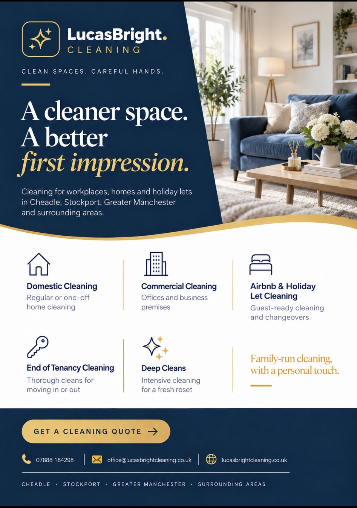
All services
A complete introduction to the five cleaning services.
View full design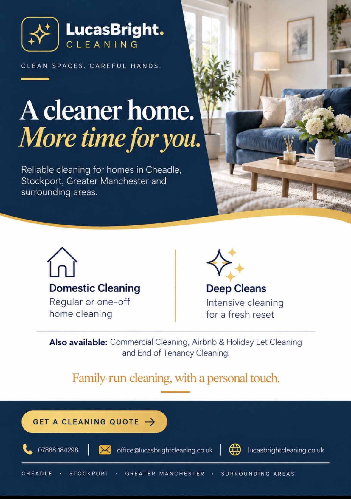
For the home
Domestic cleaning and deep cleans, with time back as the main message.
View full design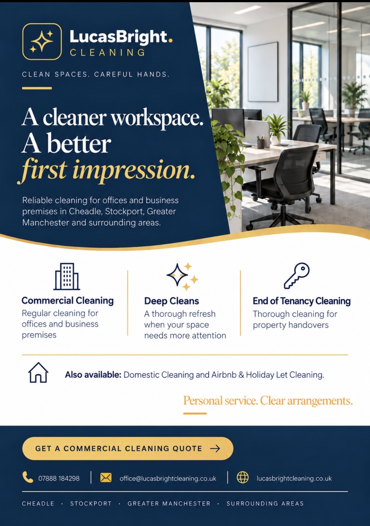
For the workplace
Office imagery and service details aimed at business customers.
View full design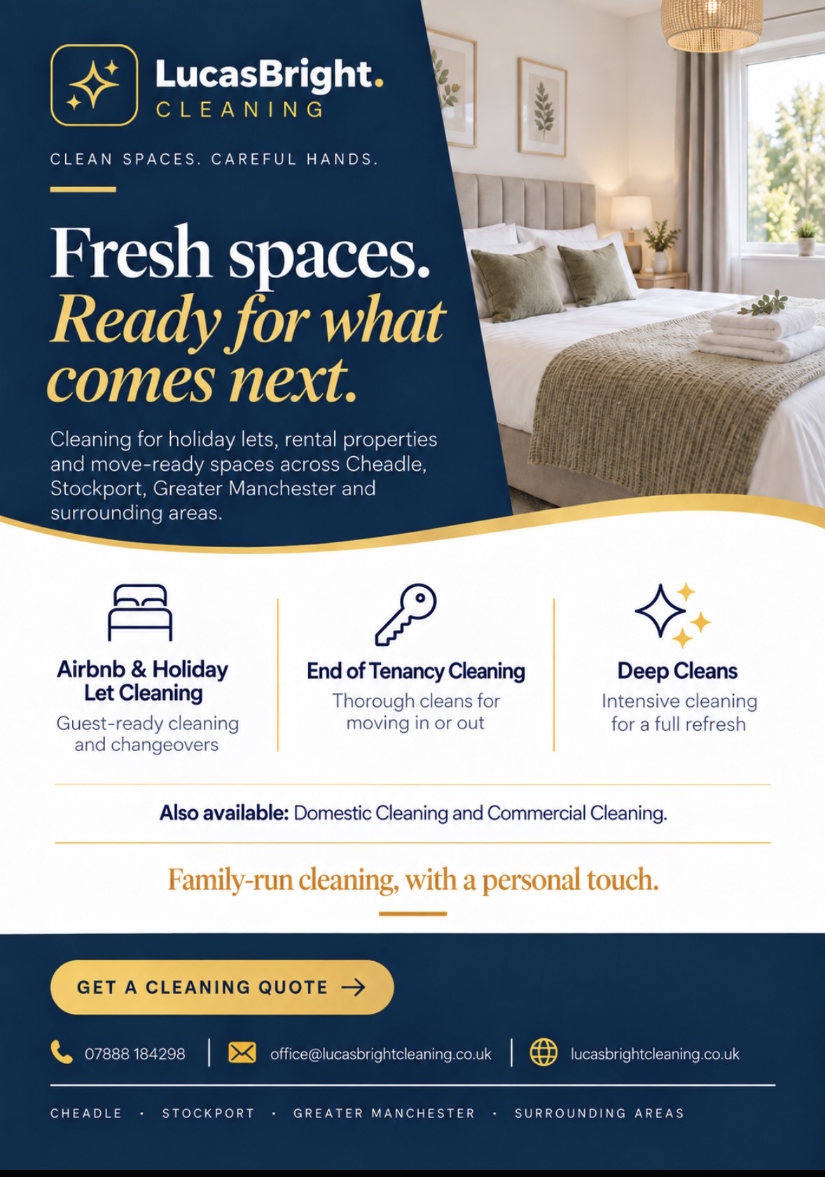
For the next arrival
Guest-ready spaces, property handovers and a fresh start.
View full design05 / The work so far
A practical launch toolkit.
The work brings together a logo and visual identity, a live website, business cards, service-specific flyers and supporting social graphics. Each piece presents LucasBright consistently while giving its audience the information they need.
It is a useful example of how website, branding, print and social design can support one another without every piece becoming identical.
In the client’s words
Client feedback.
★★★★★
We’ve had a brilliant experience working with Byhorn Design on LucasBright Cleaning.
From the original branding and logo through to our website, flyers, business cards and social media graphics, everything has been designed to look consistent and professional.
LucasBright is run by Dan’s partner, Suzanne Lucas.
Services used
Build your own project scope.
Each service can stand alone or connect with the others when the business needs a more consistent launch or refresh.
06 / Your next project
Launching
something
new?

Tell me about the business, what you need for launch and where customers are most likely to encounter it.