LucasBright Cleaning / Brand, web & print
A complete identity.Built to work everywhere.
I designed the identity, live service pages and guided quote form, then connected them with business cards, service flyers and social graphics.
LucasBright is the business I run with my partner Suzanne.
- Brand identity
- Website & enquiries
- Print & social graphics
Created by Dan / Greater Manchester
The brief
One clear impression.
Establish a professional, recognisable cleaning business across its main customer touchpoints.
The approach
A connected visual language.
Use navy and gold consistently, separate home and workplace information, then ask the questions relevant to each clean.
My contribution
Digital meets print.
Dan’s design and build: identity, live website, five-stage enquiry, business cards, four service flyers and social graphics.
The result
A consistent business identity.
A connected toolkit that presents LucasBright clearly wherever customers find it.
01 / The live website
The identity,
brought to life.
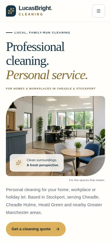
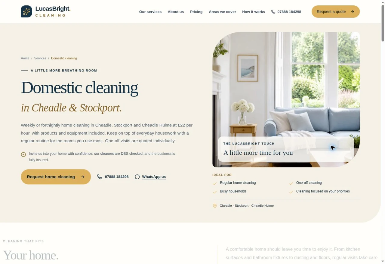
The navy-and-gold identity becomes a complete digital experience: clear routes for homes and workplaces, useful service information and an enquiry journey designed around the customer.
Visit the LucasBright website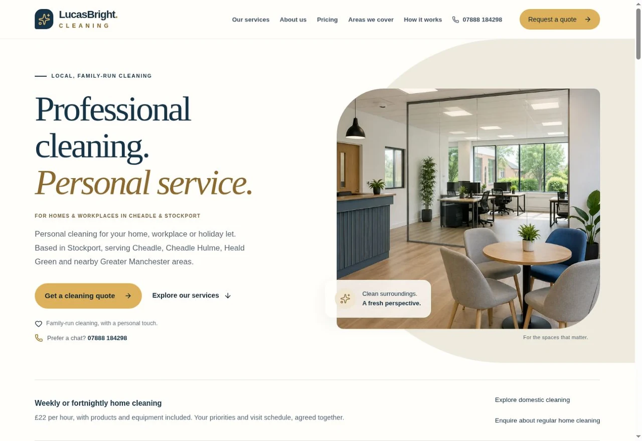
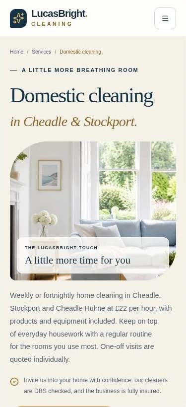
Every screen.Desktop homepage and mobile service page.Genuine browser captures,
27 October 2026.
A clear first impression.
The same colours, typography and tone connect the website with the cards and flyers.
Clear routes to the detail.
Domestic and commercial service pages help visitors find the information relevant to their space.
Designed around the screen.
Comfortable reading, clear controls and a responsive enquiry journey carry the design onto smaller screens.
Explore the service-page design and build foundations
Descriptive page titles, headings, internal links and a submitted sitemap give search engines clearer information about the business. These are sound search foundations; visibility still develops over time alongside reputation and wider business activity.
Explore Byhorn website design02 / The enquiry experience
A smarter way
to enquire.
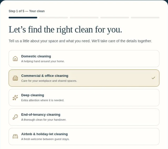
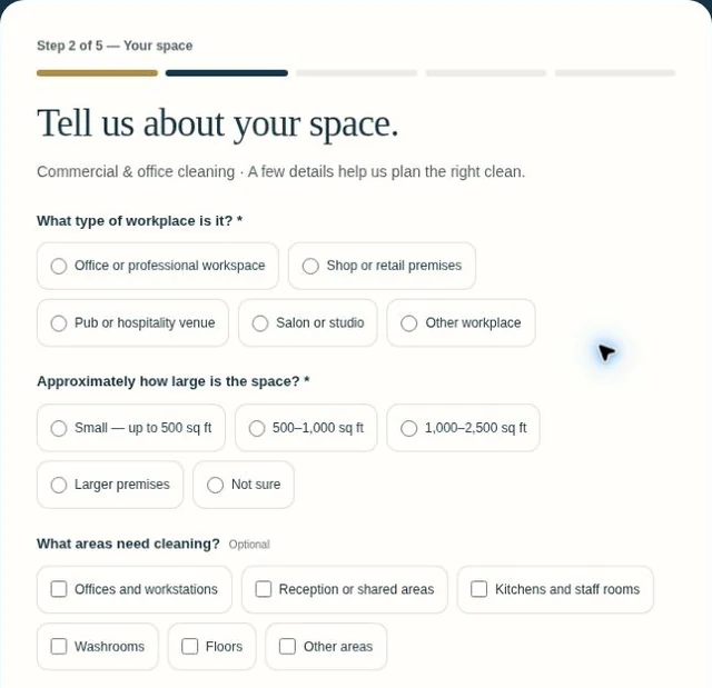
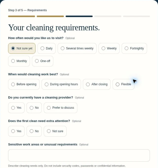
Five considered stages gather the details needed for a personalised response. The questions change with the service, so a home and a workplace are treated differently.
Choose a stage to explore the actual form.
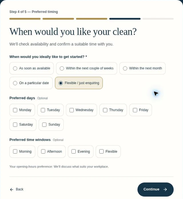
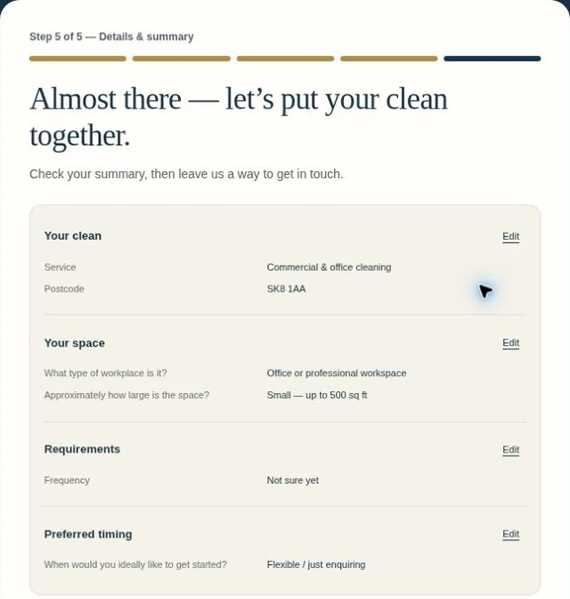
See how the questions adapt on mobile
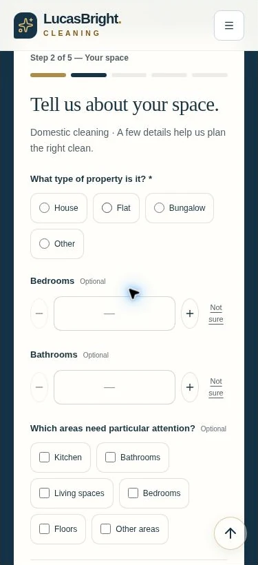
The same journey.
Questions that fit the customer.
Large choices and simple number controls make the domestic enquiry comfortable to use on a phone. Commercial enquiries ask about the workplace instead.
All five walkthrough screens are genuine captures of the published form. The summary uses example answers; no contact details were entered and no enquiry was submitted. The final stage is shown before submission.
03 / Printed brand applications
From screen to something
you can hand over.
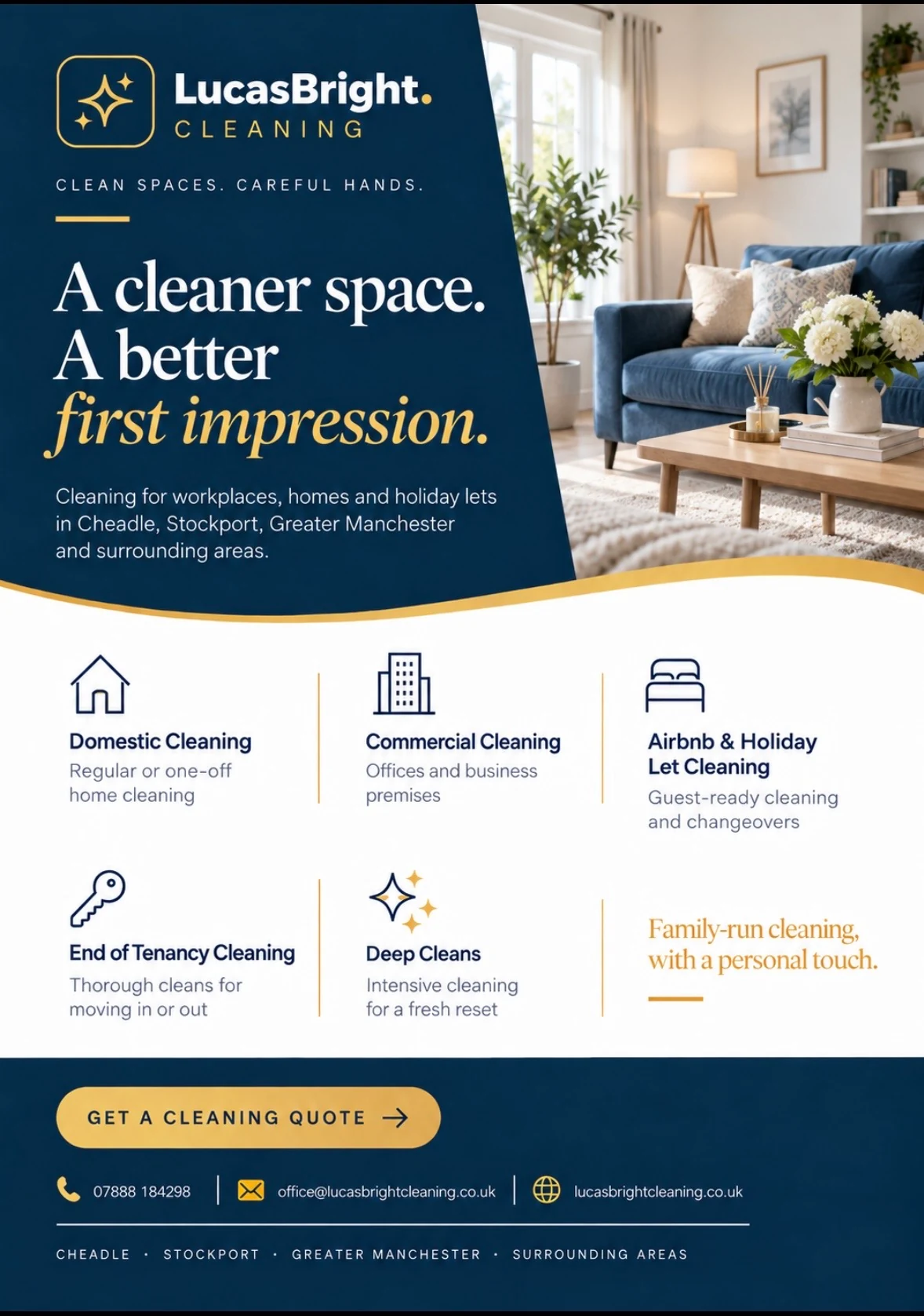
The website carries the detail, the card keeps the essentials close to hand, and each flyer speaks to a particular audience.
Two sides. One clear introduction.
Explore Business Cards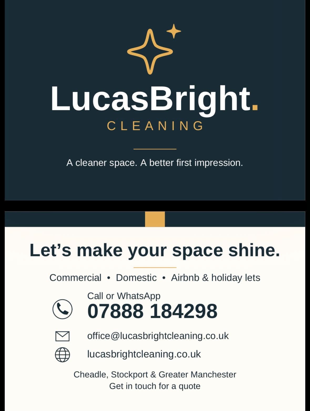
View the full card design
Explore business card design and print
One identity.
Four different messages.
An all-services introduction, then focused messages for homes, workplaces and the next arrival. The approved designs keep their distinct audiences while belonging to the same family.
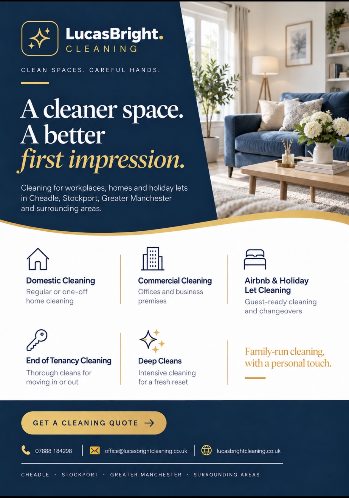
All services
A complete introduction to the five cleaning services.
View full design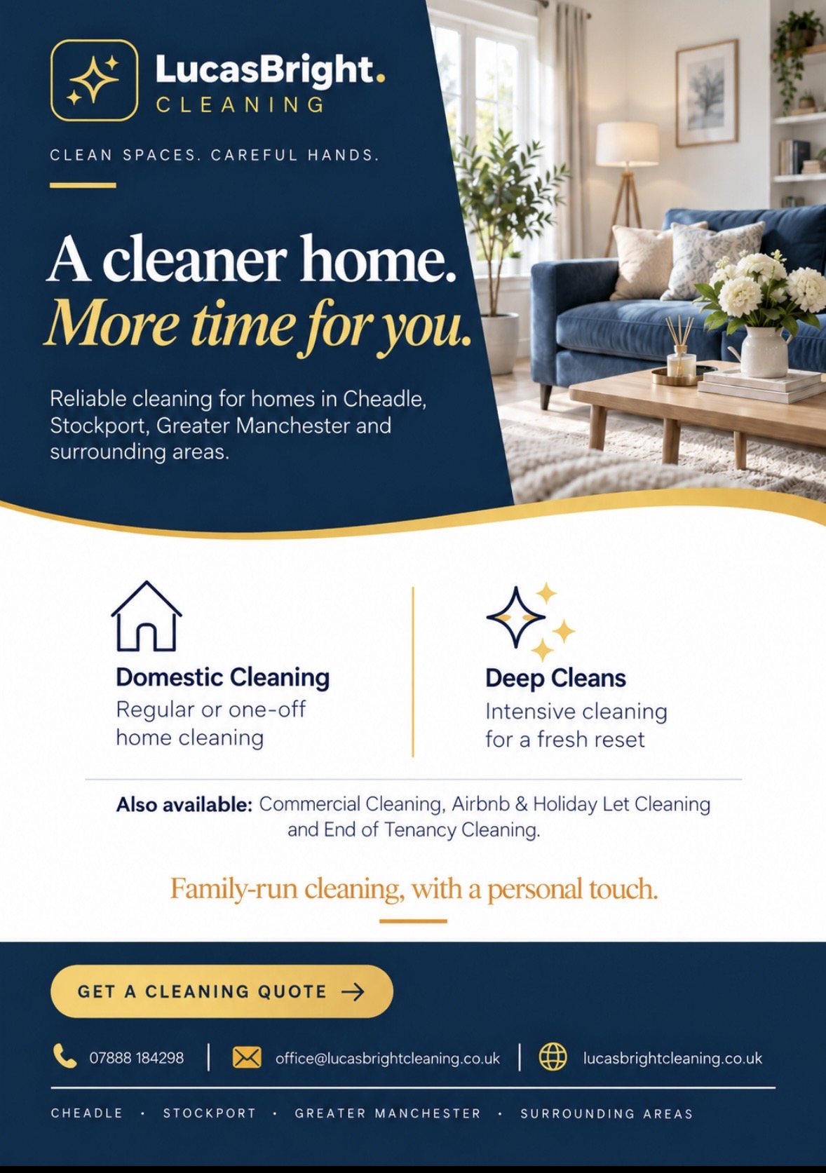
For the home
Domestic cleaning and deep cleans, with time back as the main message.
View full design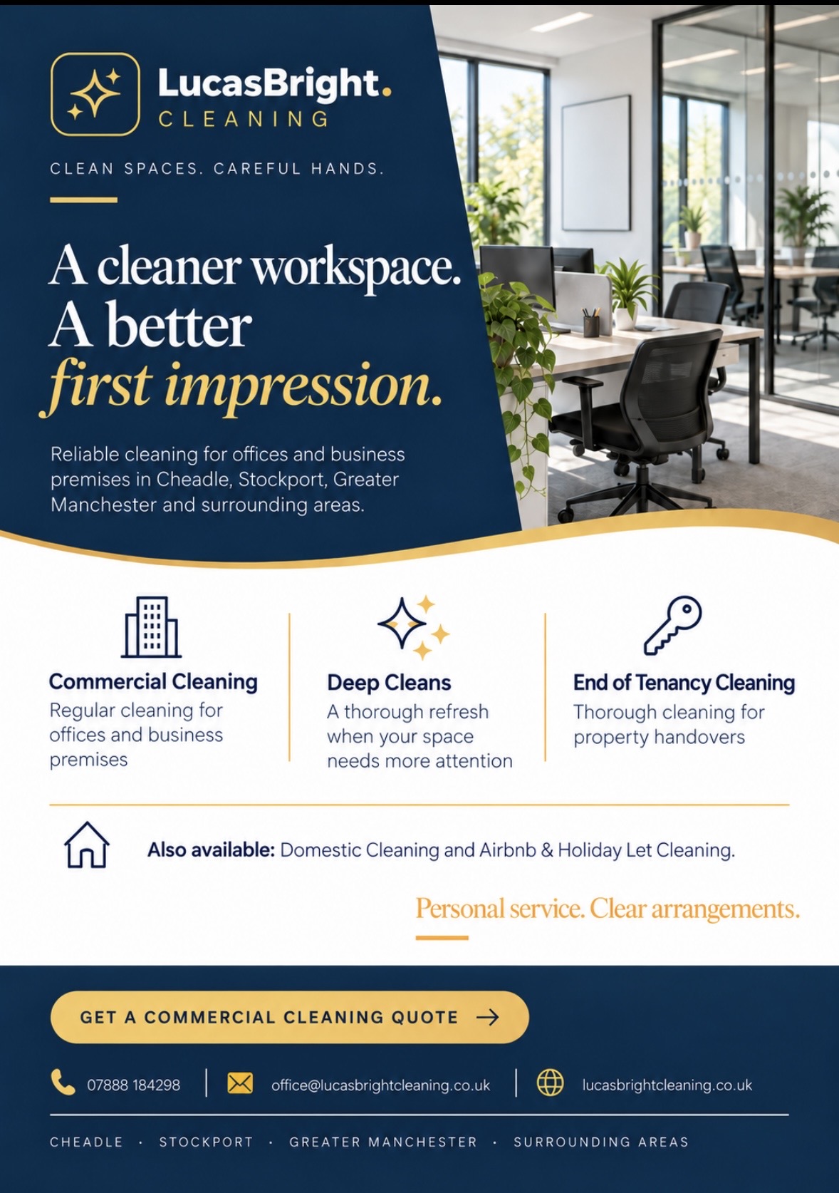
For the workplace
Office imagery and service details aimed at business customers.
View full design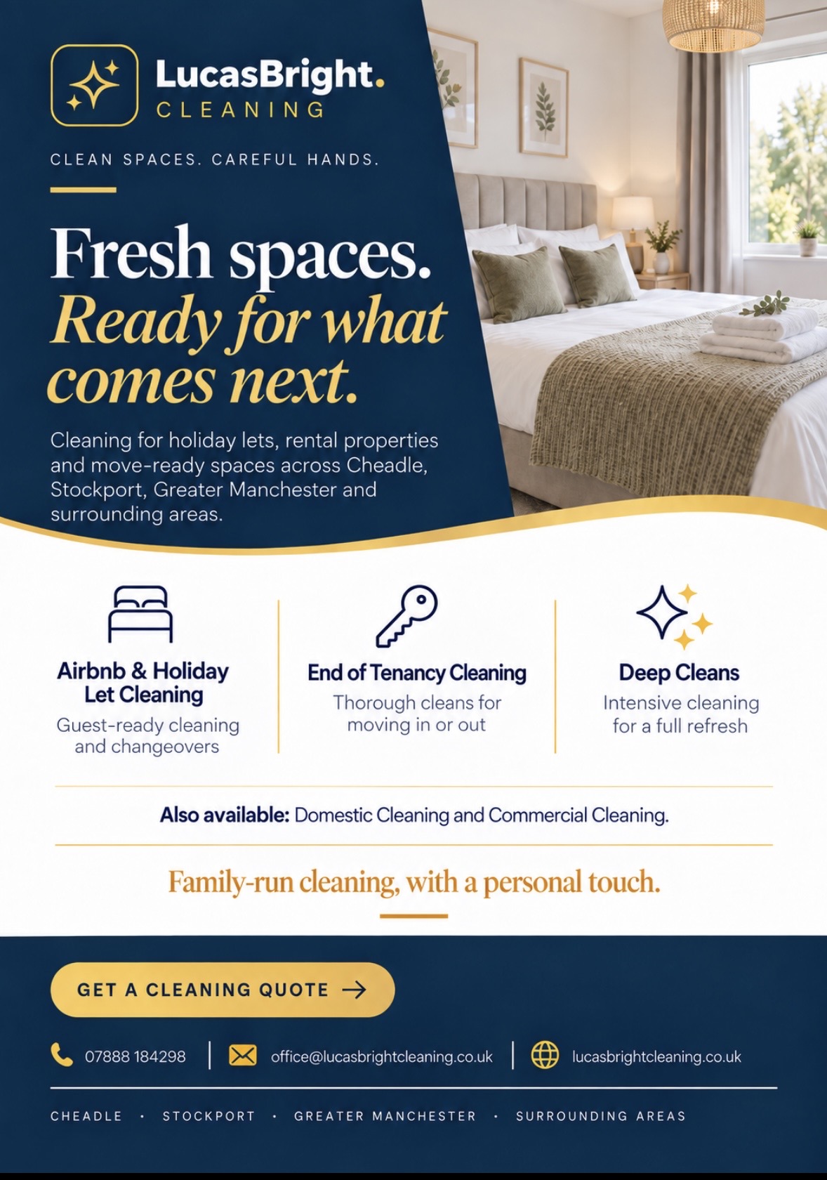
For the next arrival
Guest-ready spaces, property handovers and a fresh start.
View full design04 / The identity
Clean, confident
and consistent.
The wordmark and sparkle symbol create recognition. Navy, gold and ivory give the identity a dependable base, a little warmth and space for the practical details.
A system, rather than a single logo.
I designed the wordmark and gold sparkle symbol, selected the palette, and developed the supporting type and layout treatment.
Recognition first. Information second.
The original wordmark leads the identity. Supporting typography and a consistent hierarchy make service details easy to follow; the website’s serif headlines give longer pages a considered editorial rhythm.
Behind the brief and design decisions
As a new local cleaning business, LucasBright needed more than an isolated logo or a single website page. People might first meet the business through a search result, a social post or a card passed from one person to another.
The service structure separates domestic and commercial needs, while the enquiry journey gathers the details for a personal response.
05 / Customer feedback
In the client’s words.
Suzanne is my partner; we run LucasBright Cleaning together.
We’ve had a brilliant experience working with Byhorn Design on LucasBright Cleaning.
Read the full review
From the original branding and logo through to our website, flyers, business cards and social media graphics, everything has been designed to look consistent and professional. The website has also continued to develop as the business has grown, with new services, improved navigation, clearer information and ongoing SEO improvements.
Communication has been excellent throughout, with great attention to detail and a real willingness to keep refining things until everything feels right.
We’re really pleased with how LucasBright now looks as a brand and would happily recommend Byhorn Design to other small businesses looking for professional, approachable design and web development.
★★★★★
06 / Your next project
One business.
One recognisable identity.
Need an identity, website and printed materials for your business? Let’s discuss what you need first.
Project scope, design decisions & credits
The project at a glance
One identity. A useful customer journey.
The brief
Present a new local cleaning business clearly, from a first search or printed flyer to a personal enquiry.
My contribution
Logo, identity, service-page structure, live website, guided quote form, business cards, service flyers and social graphics.
The design decision
Carry the navy-and-gold identity across print and digital; separate domestic and workplace information, then adapt the questions to the service.
LucasBright is the business I run with my partner Suzanne. Her feedback below is presented with that relationship disclosed.
Explore the service behind this work