Selected Work / Logo & Brand Identity
The Clean Network.
The original logo and visual identity for The Clean Network, used by the business for approximately six years before its rebrand as Tidyee.
- Client
- The Clean Network
- Work
- Logo & visual identity
- Designer
- Daniel Hornby
- Selected direction
- Option B
01 / IDENTITY DEVELOPMENT
Exploring the identity.
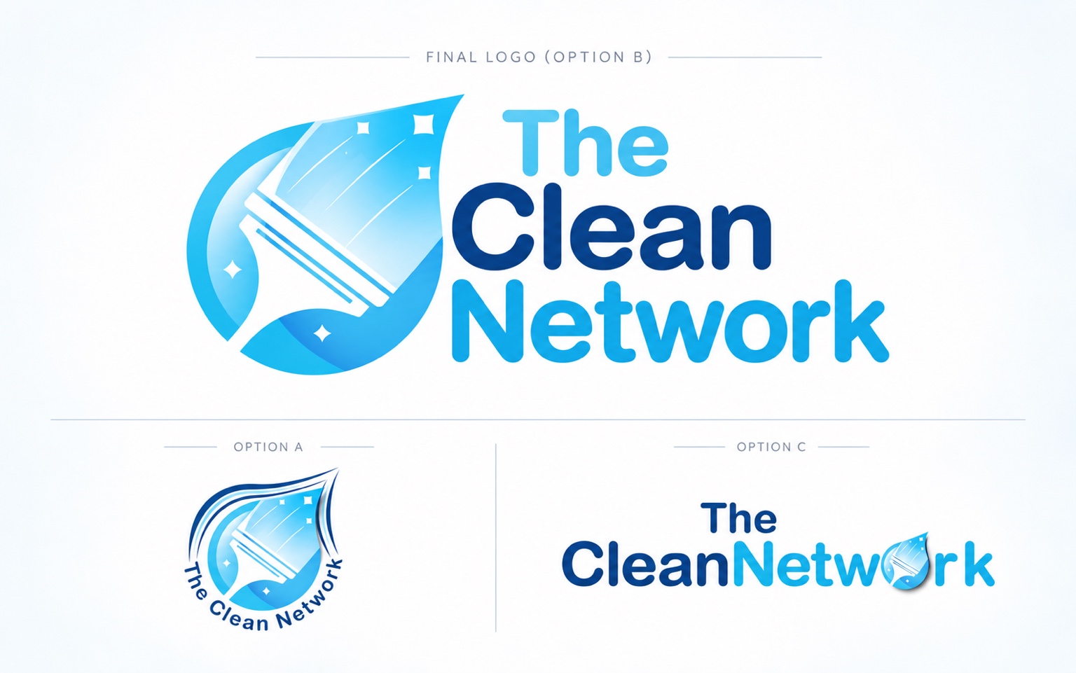
Three genuine identity routes were developed around a clean, recognisable window-cleaning motif. The selected direction combined the droplet/squeegee symbol with a straightforward blue typographic treatment designed to remain clear across different applications.
Option B was selected and adopted by the business. Options A and C show the genuine alternative routes developed during the commission.
02 / THE ADOPTED IDENTITY
A logo that went into real use.
Option B was adopted as The Clean Network’s working business logo and used for approximately six years. The company has since rebranded as Tidyee. Byhorn designed the original Clean Network identity; the new Tidyee branding is not Byhorn’s work.
Client feedback
What the client said.
Daniel and his team created a great brand logo and digital presence for one of our companies. Excellent creative flair with good commercial balance. We look forward to working with them again.
★★★★★
03 / BUSINESS CARD APPLICATION
Extending the visual identity.
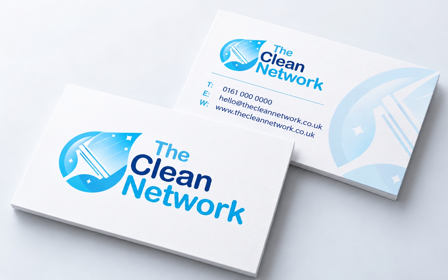
A contemporary business-card concept demonstrates how the adopted logo can extend into simple branded stationery while retaining the clean blue-and-white visual language.
This portfolio identity-extension concept is not evidence that these exact cards were historically commissioned, printed or supplied to the client.
Contact information in this concept is presentation information, including a placeholder telephone number.
04 / IDENTITY IN REAL-WORLD USE
The identity in historical use.
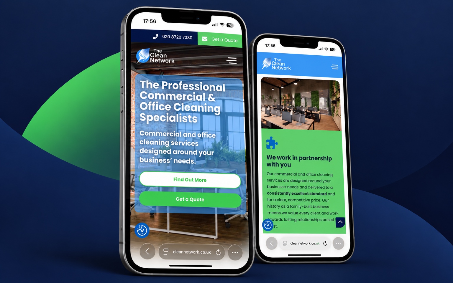
This retained historical website presentation shows the adopted Clean Network identity before the company’s rebrand as Tidyee. Byhorn Design created the original logo and visual identity; website design and development were by others.
This image records historical client adoption and commercial use of the original logo. It does not depict the company’s current branding.
Keep exploring
More from the portfolio.
Your next project
Bring experience
to your next
idea.
Tell me what you are creating, where it needs to work and what you already have. We'll take it from there.