Case study / Music identity & logo development
SoldjaSoulz.
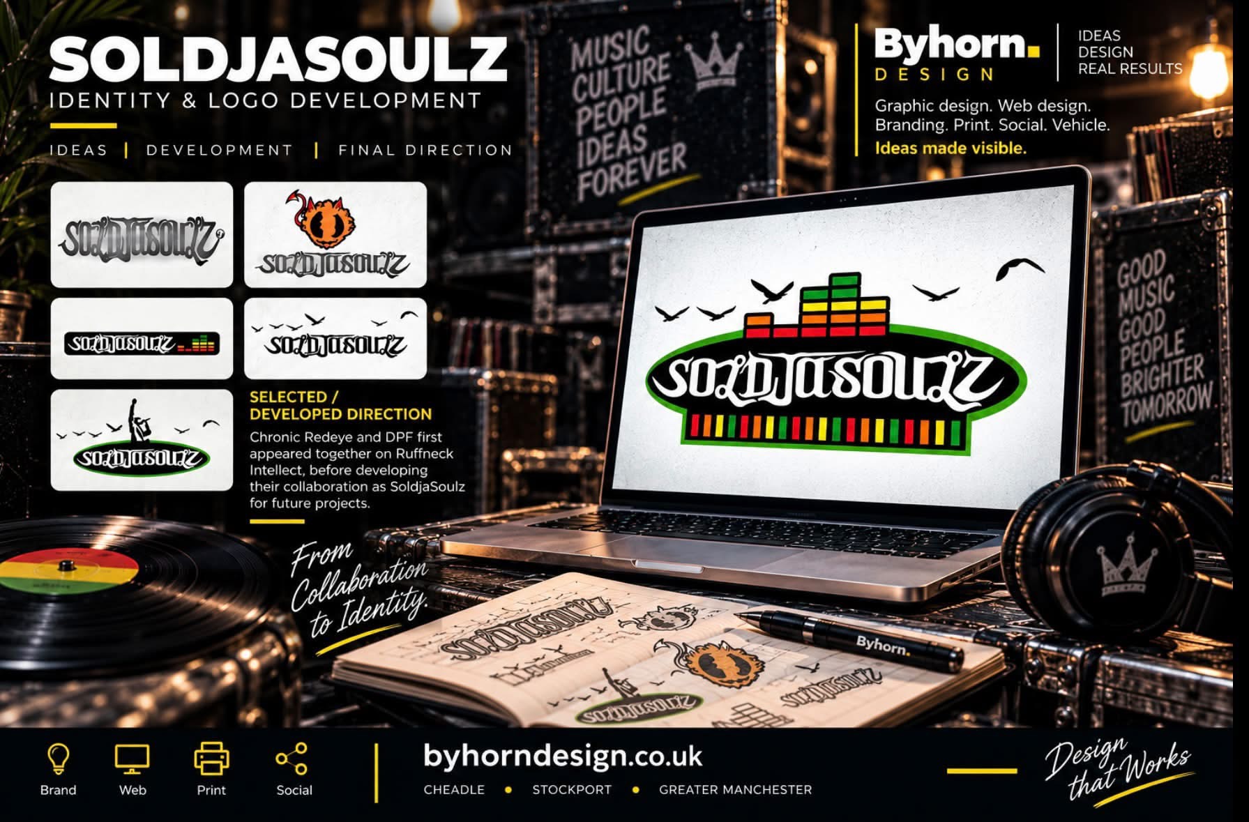
Logo ideas and a selected direction for a music collaboration, connecting expressive lettering with the visual language of sound.
- Project
- SoldjaSoulz
- Work
- Logo concepts & identity development
- Designer
- Daniel Hornby
- Related project
- Ruffneck Intellect
01 / A music collaboration
A shared sound. An identity of its own.
SoldjaSoulz sits within the same circle of music projects as Ruffneck Intellect. Chronic Redeye and DPF appeared together on that release before developing their collaboration as SoldjaSoulz.
I explored several ways of giving the name a recognisable visual character, moving between lettering, music symbols and a broader sound-system feel. Showing the alternatives makes the development process part of the story.
02 / Logo development
Exploring the directions.
The early options show how different symbols, lettering and arrangements were considered before the selected direction.
03 / The selected direction
A mark shaped by music.
The developed direction brings the white lettering into a dark oval, with red, yellow and green equaliser bars providing rhythm and colour. Bird silhouettes add a recurring detail above the name.
This is a separate identity project within the music archive. The related Ruffneck Intellect album project shows another part of that creative relationship.
In the client’s words
Client feedback.
This recommendation covers the wider music work, including album covers and flyers.
★★★★★
We have used Byhorn for various music related projects - album covers, flyers etc. Always very helpful and knowledgeable with a good grasp of client requirements. Would highly recommend.
Keep exploring
More from the portfolio.
Your next project
Bring experience
to your next
idea.
Tell me what you are creating, where it needs to work and what you already have. We'll take it from there.