The Clean Network / Original logo & identity
Daniel Hornby · Byhorn DesignThe Clean Network. Three directions.
One recognisable identity.
Three original logo routes for a cleaning business. One client-selected direction, adopted as The Clean Network’s working identity.
Follow the creative journey
01 / Creative exploration
A shared starting point.
Three different expressions.
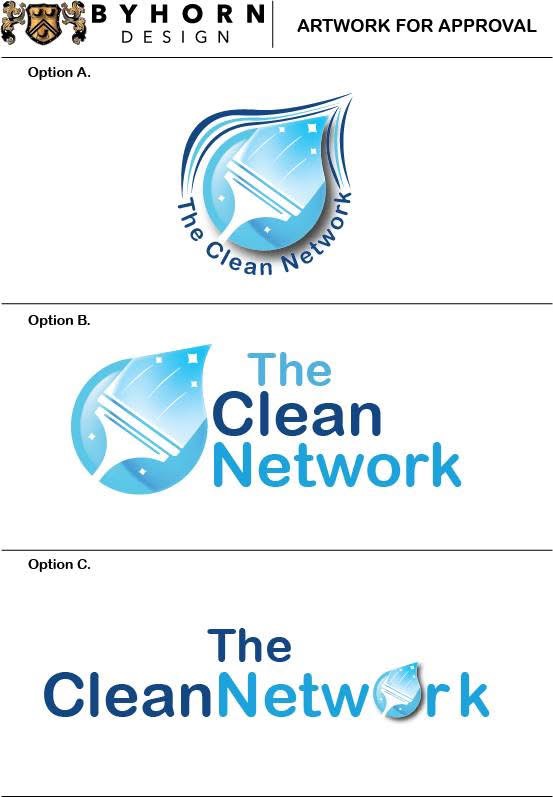
A droplet, a squeegee and a blue palette connect all three routes. The original approval artwork shows how changing the relationship between symbol and name changes the character of the identity.
The three directions below use reconstructed presentation artwork for clearer viewing. Compare the original approval sheet ↗

A compact emblem.
Layered outlines frame the droplet, with the name curving around the base of the symbol.
Symbol and name, side by side.
The droplet sits alongside a stacked wordmark. Deep blue gives “Clean” emphasis within the lighter blue name.

A wordmark-led approach.
A wider arrangement brings the droplet into the lettering, making the symbol part of the name.
The adopted identity / Option B
A recognisable mark.
A straightforward name.
The chosen direction keeps the cleaning motif and business name together without enclosing the lettering around the symbol. The squeegee and small highlights make the service visible within the droplet itself.
The client selected Option B. The original alternatives remain here as part of the genuine creative process.
View the original approval sheet ↗02 / From approval to adoption
An identity
put to work.
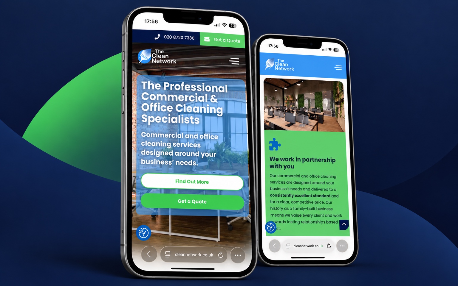
The selected logo became The Clean Network’s business identity and, according to the project record, remained in use for approximately six years.
The retained website presentation shows the original identity in commercial use. Website design and development were by others.
The business is now Tidyee. The later Tidyee branding is not Byhorn’s work. Rebrand context ↗
The client’s perspective
★★★★★“Excellent creative flair with good commercial balance. We look forward to working with them again.”
Google review · Read the full review on Google ↗
03 / Identity applications
The identity,
in another setting.
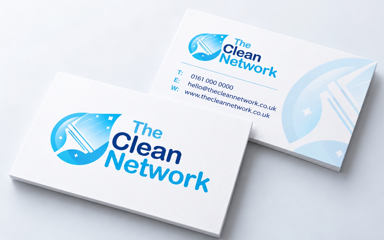
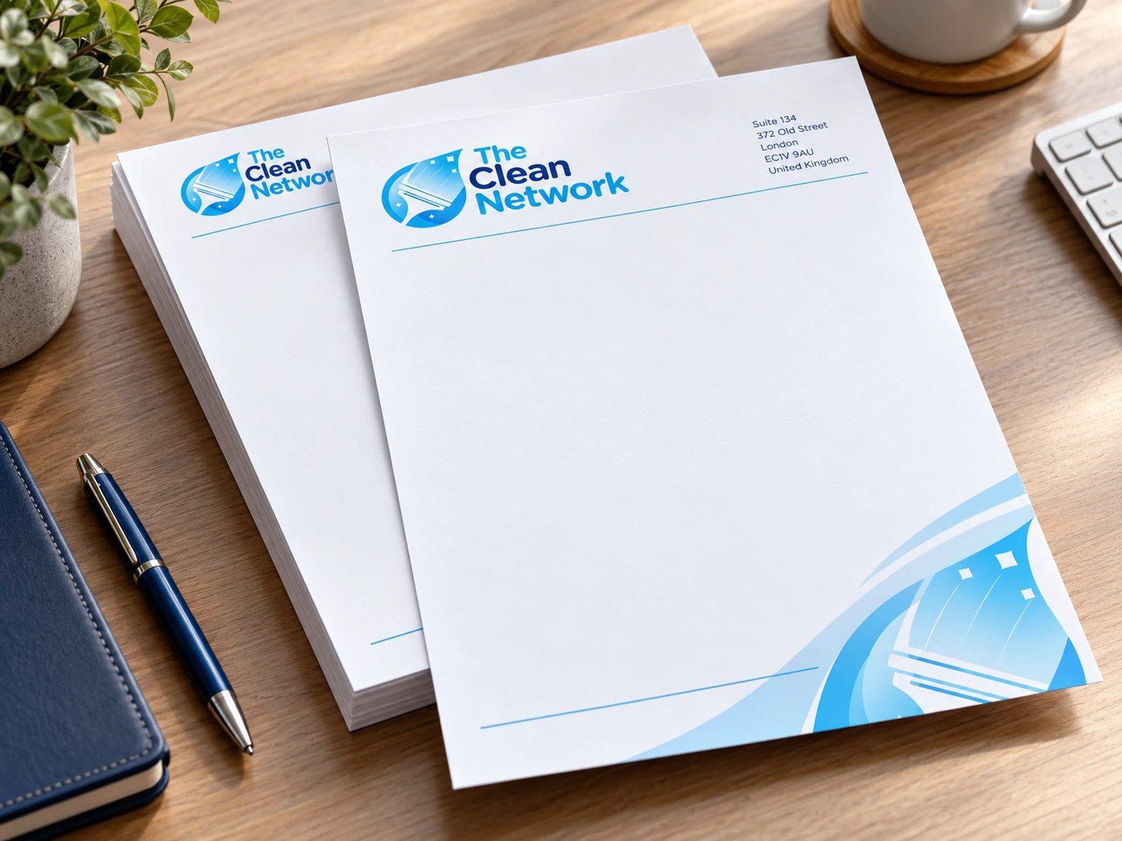
Later business-card and letterhead concepts explore how the original identity could carry into everyday correspondence: blue accents, clear information and space for the message.
Portfolio concepts, separate from the original logo commission. These presentations do not document printed client deliveries. Contact details are illustrative; the card includes a placeholder telephone number.
A compact introduction.
Business-card concept / front & reverse
Space to communicate.
Letterhead / later design concept
From the original idea
to a recognisable visual language.
Explore the service behind this work
Your next identity
Let’s find the right
direction for you.
A new business, a fresh start or an identity that needs a clearer purpose. Tell me what you have in mind.
Discuss your logo & identity Explore logo design ↗